Entry Date

26/11/2010

Stephen Farthing - The Back Story


(Image: http://newsevents.arts.ac.uk/files/2010/11/boucher-back-story-11421.jpg)

 As a group we visited the Royal Academy to see the Artist's Lab show 'The Back Story', by Stephen Farthing, a show focussed on art history and context as an impetus for the creation of work. Our particular focus was on 'The Back Story' (above), a painting based on the story of Francois Boucher's 'Resting Girl' (Below), a painting where Farthing thought the context surrounding it's depiction of a 14 year old nude was in fact as interesting as the painting itself.


(Image: http://www.2artgallery.com/gallery/images/Resting-Girl-1752.jpg)

 Written below are notes taken whilst at the exhibition:

 'The back story painting - literal interpretation of inscribing a narrative behind the painting and letting it bleed through - a sense of deliberately obscuring the image with narrative but at the same time obscuring the narrative as well by writing backwards - does the text then become a pictoral element as well?
 Has the effect of making the viewer want to engage with the piece but shutting them out of it at the same time - no less illuminating than the original? Although it could be argued that in fact he does introduce elements of layers to a seemingly otherwise straightforward nude - the viewer is assured that there is something else behind it, if not sure exactly what.'

 Farthing himself states of his work that it is about, '...degrading [meaning] on purpose, so it becomes not more ambiguous, but less what it was in the first place'.

 However, it seemed to me, particularly with 'The Back Story', that Farthing was in fact trying to make the painting more than what it was in the first place, yet I felt that the reversal of writing and obstruction of the image proved almost to be an unnecessary gimmick, removing the emotive power that the original story and provenance actually has.

 The second piece of Farthing's work that I wanted to look at was a detailed project regarding the mapping of artists into his own categories, in an attempt to place them both inter-relationally as well as contextually. Below are some more notes made on the day:


(Image: http://static.royalacademy.org.uk/images/width267/screen-shot-2010-12-08-at-18-05-59-11735.png)

 'As in 'The Great Bear' (below) - Farthing deliberately uses a language we are familiar with, the Tube Map, but in difference to that, every link and placement appears to be deliberately chosen. The lack of scale suggests a map of ideas, styles, processes, with a disregard of where they appear in time, by detailing them more in smaller panels, there is a little more clarity as to why Farthing has chosen them.'


 I left the exhibition still unsure as to what I felt about 'Mapping Artists'. In many ways I found it an intriguing piece of work, but maybe it was the familiarity or ubiquitous nature of Beck's tube map that impacted on how Farthing's piece worked. Maybe a map that is non-linear through time, does not have to be drawn in a linear fashion.

19/11/2010

Presentations


(Image: http://thebloghorn.org/wp-content/uploads/2010/11/collins_in_room_208-400x288.jpg)

 Following Presentations on Jean Luc Godard's 'Vivre Sa Vie', there were more on the Graphic Novel, as well as John Baldessari's Goya series, as well as the video for Bob Dylan's 'Subterranean Homesick Blues'.

 Above is a section from Stephen Collins' 'In Room 208', a short story that perfectly blended Text and Image into a surreal hybrid that moved across the panels seemingly without any break in narrative or image. This was a good introduction into how Graphic Novels have increasingly used text as image, both within and outside of their Panel Structure.


(Image: http://www.rfc.museum/images/stories/RFC/HowSoonNow/Baldessari-J_GoyaSeries-TheSameElsewhere.jpg)

 John Baldessari's Goya series clearly separates Image from Text, keeping strictly within the same format throughout the whole series, and as a response to Goya's original series of etchings (example below), it provided an interesting contrast, reducing the emotion of the original writing and images of the horrors of war to simple household objects. The work by itself proves almost frustrating to the viewer, with both meaning and connections seemingly deliberately obscured, but, in the minimal simplicity of the layout and type, appearing as if they should be connected. I wondered when looking at this whether the viewer could ever understand the meaning of this work without the original context of Goya's series? And what impact does this have on the effectiveness of Baldessari's work? 


(Image: http://pressblog.uchicago.edu/disasters-of-war.gif)

 Finally, we watched Bob Dylan's video for 'Subterranean Homesick Blues, originally a trailer for the 1965 documentary, 'Don't Look Back'. As a video, it proves to be well ahead of its time, and engaging in its simplicity. The slightly mischievous nature of Dylan as the song progresses, and the cards get shuffled out of order, and mis-spelt or left out gives the audience an impression of someone who knows what they are doing. The phonetic spelling on the placards, as well as the pace at which the song progresses serve to highlight the rhythm of speech and music throughout the video. 


(Image: http://tctechcrunch.files.wordpress.com/2010/09/screen-shot-2010-09-08-at-1-48-47-pm.png?w=269&h=244)

10/11/2010

Jean Luc Godard - Vivre Sa Vie


(All images: from camera)

 This week we were asked to look at an aspect, or treatment of Image and Text, in greater detail, ours being the 12 tableux of 'Vivre Sa Vie', by Jean Luc Godard, with particular regards to the use of subtitling and voiceovers, in its treatment of text in different forms. Below is the original presentation that a group, including myself, Scott English and Debbie Leane, gave:

 'Jean-Luc Godard has been referred to as the most controversial film-maker of the post war period.
 Although considered a pioneer of the French New Wave, over the decades his approach to film-making underwent many shifts in emphasis, subject and construction.


 Godard was particularly affected by the may 1968 Paris riots, which influenced a change in direction within his film-making that has been described as the shift from ‘pleasure to the polemic’, that has naturally divided critics and writers ever since.

 For example, Nina Hibbin deplored the placement within such films as ‘Sympathy For the Devil’ and ‘British Sounds’, of ‘his little ideas against the big problems’, leading to a kind of, ‘pedantic intellectual purism’, that many critics have described as simply boring, when compared to the sensuality of Godard’s earlier work.


 Nevertheless, the way in which Godard viewed himself and his work, remains interesting regardless of how the film was received. In his video introduction to ‘Passion’ (1982), Godard presents himself as simultaneously in control of the film, as well as under the film’s control, with the screen as a blank page, or beach without sea, ‘I create the waves’.


 The script becomes secondary to the film: ‘there are certain given facts, the camera makes the probable possible’, and there is an idea of a film pre-existing, with director only there to make the ‘invisible visible’.

Vivre Sa Vie (my life to live), made in 1962, tells the story of a young shopgirl, in 12 parts, or tableaux. Short of money, she turns to prostitution. 
The 12th tableaux, known as the ‘oval portrait’ is the closing chapter of the film. Perhaps the most complex and dense section of vivre sa vie, it best illustrates Tom Milnes definition of Godard’s work as ‘film essays’. 

 1. The opening shot of the chapter is just text, and appears as a direct reference to silent cinema, with a description of the scene before it happens, this perhaps could lull the viewer into a false sense of security, by appearing to give them the knowledge of what will happen before the scene unfolds. However, as the tableaux progresses, we soon realise that in fact, whilst the text is not necessarily inaccurate, it can only give a brief overview of events, with nowhere near the same level of detail as film. So maybe Godard is highlighting the limitations of using text as a descriptive tool within moving image, something he alludes to in the statement, ‘rather than talk, I’d rather see’.

 2. References to silent cinema continue as the tableau progresses, interchanging between subtitled silence and diagetic narration. The deliberate reference to silent cinema appears in direct contrast to the subject matter of the film, the lead characters discuss trivial everyday subjects like the rain and whether they were going to go out as they dance - almost in imitation of the excitement and frivolity of early silent cinema. To the viewer this appears as a contrast to the subject matter of the film and the tragic circumstances that Anna Karina finds herself in. 

 3. Juxtaposed between the scenes of silence we hear a diagetic narrative from Edgar Alan Poe’s ‘Oval Portrait’ read by a young man. Whilst the text being narrated seems initially unconnected to the plot of the film Godard deliberately manipulates the direction of the camera work to suggest connections and links between the two.

 4. Other possible references within the film:


 Hollywood reference – shot of car and gangsters


 Self reflexive - queue at cinema suggestion of the process of film making and film watching


 Arc de Triumph – reminder of location (paris) perhaps a reference to the empire/napoleon or social    values of France.


 Hades & Sons – sinister choice of name, lord of the underworld'


05/11/2010

Image and Text and Photography


(Image: http://farm4.static.flickr.com/3092/2295812579_40915a9147.jpg)

 This seminar consisted of a closer application of what has been learnt about Image and Text so far in the elective, to specific works and pieces, using analysis to gain a greater understanding of the effect of Image and Text in Art.

 I started by looking at 'numbers 0 through 9' by Jasper Johns (above), considering how, through overlay and block colour, Johns has transformed how we read numbers from a symbolic representation of an amount, into imagery and form. The use of depth particularly alludes to a sense of space and three-dimensionality perhaps more common to moving image: the illusion of looking 'through' a film, or time. This is an example of complete Image/Text hybridity, both elements dependent on each other totally, to create the work.


(Image: http://farm3.static.flickr.com/2431/3716428736_fba98f4cbb_z.jpg?zz=1)

 Another piece that particularly struck me was Duane Michals' 'A Letter From My Father' (above). The contrast between studio shot and hand-written text creates a slight sense of unease, as the personal nature of the text collides with the professionalism of the photograph. This piece was a good example of how the artist's choice of image and placement manipulates the viewer's understanding of the work, in that, by placing the text underneath the image, one cannot help but try and use the text to read meaning into the photograph, even after it is apparent that the characters in the photograph are models, and not personally connected to the text at all. 


(Image: http://www.sauer-thompson.com/junkforcode/archives/2009/01/06/ShoreSbillboard.jpg) 

We concluded the session with the consideration of how absence of text affects an image, with this photograph by Stephen Shore. The idea of a trace, or evidence of text within an image can prove almost as powerful as the image itself, and could potentially engage the viewer even more, as meaning becomes more vague, or difficult to grasp. 

29/10/2010

Loud Flash - British Punk on Paper


(Image: http://zedequalszee.files.wordpress.com/2008/08/orgasm-addict.jpg)

 Loud Flash - British Punk on Paper was an exhibition of british punk posters, flyers and ephemera, exhibited next to other printed matter of 1977, including the Queen's jubilee, as well as far-right propaganda from the National Front. The task for the day was to consider common signifiers throughout punk imagery, as well as considering how the language used could connect with historical movements of the 20th Century. Below are the initial notes I compiled from the day:

 'Common signifiers - photographs of bands usually form the main part of images, confrontational, use of newspaper style photographs, sense of violence, or anger - revolution. Imagery of guns or riots in a cut and paste style follows through in text almost in the style of ransom notes. A common language of unconventionality and disregard to formality, although interestingly, in some of the posters (such as 'orgasm addict', above) an educated formality remains.
 Dada and Surrealist influences in the use of collage - clash of colour - vibrancy and bold statement.
 Very deliberate references to other revolutionary movements, such as the aesthetics of the may '68 riots.'


(Image: http://www.aworldtowin.net/images/images330/laLutteContinue.JPG)


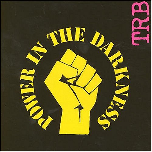
(Image: http://www.amiright.com/album-cover-themes/images/album-Tom-Robinson-Band-Power-in-the-Darkness2-lps.jpg)


 Above is just one example of how Punk referenced both situationist imagery and aesthetics in its approach to visual language.
 What surprised me the most perhaps about the exhibition was the willingness of Punk's visual aspects to pick and choose from movements across the 20th Century in its treatment of image and text, yet what stopped it from initially becoming a simple pastiche was the context it was applied to: although treated in a surrealist way for example, the images used were of the 1970s so the effect became all the more pertinent by harnessing the connotations of a way of treating image and text but applying it to such a specific context. In this way, it could be argued that Punk was, in its prime, a Situationist force, using the idea of lived experience to comment directly on its own context and place in time. 


28/10/2010

The Situationists


(Image: http://www.ctrl-n.net/images/journal/journal_nakedcity.jpg)

 Ahead of a visit to the 'Loud Flash' exhibition at Haunch of Venison, we were asked to conduct some research into previous art movements of the 20th Century, so as to arrive with a sense of context. Below are my initial notes from that research:

( key ideas read from 'The Society of the Spectacle' online at www.bopsecrets.org/si/debord/1.htm)

 'some of the main principles of the Situationists:

 1. In societies dominated by modern conditions of production, life is presented as an immense      accumulation of spectacles. Everything that was directly lived has receded into a representation.

 2. The spectacle is not a collection of images: it is a social relation between people that is mediated by images.

 3. In a world that is really upside down, the true is a moment of the false.

 The Situationists defied any strict definition, with the concept of a static ideology being for them too far removed from life experience, social relation and the ability of human behavior to connect and reaffirm itself. This is probably how the concept of psychogeography arose.
 They had a foundation in libertarian Marxism, but were not tied to it.
 Situationism as the first movement to identify the conspicuous consumption of consumer goods as an issue, an alienation determined by the Spectacle:

 "The Spectacle is capital accumulated to the point that it becomes images" (Debord)

Possible similarities to the Punk movement:

 1. Punk's democratisation of music and rejection of consumerism is close to the Liberal Marxist foundations of Situationism, and it could be said that there was an awareness within Punk of the power of Consumerism on the public.

 2. This is evidenced by Punk's DIY aesthetic, both in its approach to fashion and writing music.

 3. A non-static ideology: Punk flirted with socialism, anarchy, communism and fascism during its brief lifespan.

 4. Punk was concentrated on social relations and revolutions, not on technical excellence or academic prowess, it was, like Situationism, an organic, DIY movement.      

22/10/2010

Further Discussions on Text and Image

 Today's seminar began to consider the typology of Text and Image, as well as examples of how it translates into moving image, a medium that, with the addition of sound, can explore text and image in many different directions.
 Two simple categories of text and image are affirmative and subversive: affirmative where text can support, or conclude an image, or indeed an image conclude, support or even illustrate, a text, and subversive where the opposite occurs, the viewers assumptions of meaning changing radically through the treatment of image or text.


(Image: http://www.mattsgallery.org/artists/doherty/1-02.jpg)

 The above image, taken from 'same difference' by Willie Doherty, is a good example of the sometimes subversive nature of the relationship between Image and Text. The same woman's face is shown on two slide projections, with a range of different words over the top, alternating between the 'good' and the 'bad', such as 'volunteer', 'murderer', 'angry' etc. The treatment of text remains exactly the same, and the result shows just how much the viewer's perceptions of the image changes according to the meaning of the word shown in front of them. I think that this not only highlights the power of Image and Text in manipulating meaning,  but also how we, as viewers are almost pre-conditioned to read all text as supportive, or affirmative, particularly when, as in 'same difference' it is branded across a picture.


(Image: http://www.notcoming.com/images/features/saulbass/wss_closing/2.jpg)

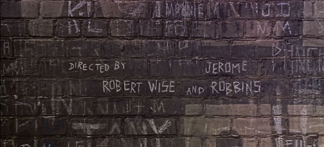
 We were then shown Saul Bass's end titles for West Side Story, which uses moving image to set text directly into the landscape and sets of the film itself, transforming the relationship between text and image into a hybrid, whereby neither one can be separated. This allows the camera to pan across the text, alluding to a sense of choreography and movement key to the nature of the film itself, something that is far removed from John Smith's 1976 film, 'Girl Chewing Gum'


(Image: http://freeartlondon.files.wordpress.com/2010/03/d_the_girl_chewing_gum1.jpg)

 In 'The Girl Chewing Gum', nearly all sense of movement is given by the characters within the shot, characters that John Smith's spoken 'text' leads us to believe are being choreographed by the director. However, as the film progresses, the narrative itself begins to lapse further and further behind the action within shot, and it becomes clear that the text itself is a description of a scene. The final reveal of the film is the realisation towards the end that the narrator is in fact not even in the street, he is standing in the middle of the field.
 The effect of this in Image and Text terms is a sense of subversion of our own preconceptions of movement and time, as well as space. The viewer assumes that the narrator is next to the camera at the time of shooting, because that is what they are being shown, and the end result is a questioning of the image being displayed.